


A short history of New York City subway signage: First in a SmartSign blog series on famous signs and their origins

The New York City subway is a symbol of New York. For over a hundred years, the subway has transported New Yorkers and visitors alike through New York’s urban canyons. Its signage is simple, elegant, and iconic, a beacon of calm in New York’s chaos. But the signs haven’t always been that way.
Originally, there were three separate, competing subway companies, with no coherent signage system between the companies, or even within the companies. The most important signs were embedded into the station walls with ceramic tile.
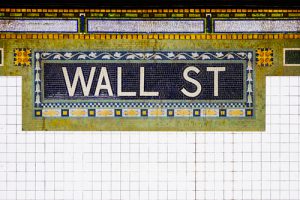
The first designers of this signage, George Heins and Christopher LaFarge, aimed to create both simplicity and beauty in their signage. Heins and LaFarge even designed their system to accommodate people who couldn’t read. The Astor Place subway station, for example, has small beaver plaques embedded into the walls. (The station’s namesake, John Jacob Astor, made his fortune in the fur business.)

In 1906, architect Squire Vickers took over the job of chief designer for all three subway companies, and Vickers streamlined the tile even more, culminating in the simple, elegant Independent Subway System tiles of 1933.
But no matter how beautiful the tile art was, it wasn’t uniform, and it was hard even for natives to navigate. Even though the three subway companies were merged together and taken over by the government, the three companies still operated separately as late as the 1960s.
Something had to be done. Thus, in 1967, the New York City Transit Authority hired Italian designer Massimo Vignelli in 1967 to design a uniform system of navigation. (Vignelli, a legend of modernist design, also designed the logos for Bloomingdales and American Airlines.)
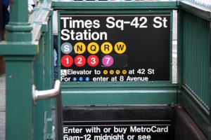
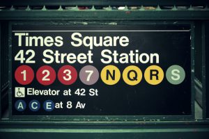
Vignelli introduced the modern system of letters and numbers, as well as the iconic sans-serif navigation system to the City. (Previously, they used Standard Medium—now, they use Helvetica.) Gone were the arcane, wordy systems used in previous years. The distinction between the three old subway companies was eliminated too. Now, every line would be identified by a single letter or number. Most importantly, he put together a manual describing how signs should be placed in the stations to aid passengers in navigating the twists and turns of the underground labyrinth. These signs are a model of Modernist simplicity, reflecting the desire of the late 1960s to rationalize complex, difficult systems.
Vignelli designed a subway map for the Transit Authority as the centerpiece of his navigation system, which was immediately hailed as a classic of design but ultimately a poor navigation tool, due to its ignorance of New York City’s geography. A certain amount of geographical distortion is inevitable in any metro map design, but Vignelli went too far. Vignelli’s geographical distortions served to only confuse passengers. Because of the city’s rigid street grid, every Manhattanite knows that 50th Street and 8th Avenue is west of Broadway, not east, as Vignelli drew it. The map was extremely unpopular at the time and junked in favor of a geographical map after only seven years. Its replacement, designed by Michael Hertz, has been in use ever since.

This is the situation at the present. The tile art of the past, while it has a secondary role now, is still going strong in New York’s stations. With the exception of the subway map itself, Vignelli’s wayfinding system largely remains in place to this day, and millions of passengers use it every year.
