A short history on the London Underground sign: Sixth in a SmartSign blog series on famous signs and their origins
The bar and disc used by Transport for London is quite possibly Britain’s most identifiable transportation symbol, as well as cultural icon.
The logo, which was created in 1905, started out as a bar crossing through a wheel, with wings to symbolize the city’s newly motorized buses. Three years later, this was changed to a bar and disc (which is what still exists today), in order to make station names more recognizable.
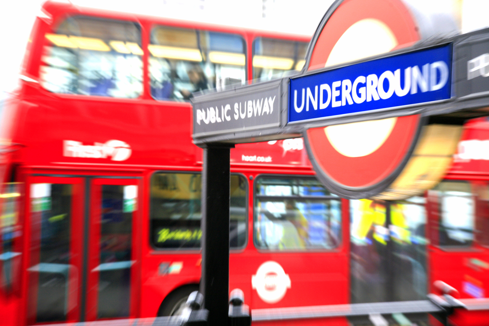
In 1913, Chief Executive of London Transport, Frank Pick, commissioned a typographer to design a typeface for the company. The roundel was eventually altered to go with the new lettering and integrate the Underground logo. The red disc was changed to a circle and this became the new trademarked logo.
The Underground Group was renamed the London Passenger Transport Board in 1933, which prompted a requested change to the existing symbol because the new name would simply be too long to fit on the roundel. This did not gain much support, as the symbol had become widely popular and people didn’t want to see it changed. Eventually, the decision was made to abbreviate the name to “L.P.T.B. Underground” in order to accommodate the symbol. The name was later changed to London Transport.
The London Underground sign is so unique due to the fact that it is one of the few signs that represent a city, a place, and a transportation network all at the same time. It is a marker that every citizen in London is proud to identify with.


