


The Branding Bible and logo design
If a picture is worth a thousand words, a company logo is valuable beyond measure. With one image, a logo conveys a company’s personality, industry, and what makes its services and culture unique.
At least, that’s what a good logo conveys. A poorly designed logo is, at best, vague about what your company can do. At worst, it serves as a giant flashing sign warning potential clients to steer clear.
Designmatic released an eBook called The Branding Bible: A Step-By-Step DIY Logo Design Guide for SMBS. We’ve combed through the book to glean the most important takeaways.
Key Message #1: Just because you have a logo doesn’t mean it’s the right one.
Perhaps you slapped together a logo when your company was just a start-up. Does it still tell an accurate story about your brand? If not, it’s time for a refresher.
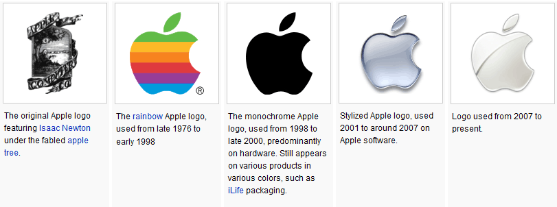
Think changing your logo will confuse existing customers? Think again. Apple has undergone several logo updates over the years. So has Starbucks and many other of the world’s most recognizable brands. If these branding behemoths can reinvent themselves graphically without alienating customers, so can you.
Your logo also needs to work with current media. Does your logo look good on your business cards as well as Facebook, Twitter, and your website? If not, you need to reformat.
Image from thinkmarketingmagazine.com.
The writers behind The Branding Bible emphasize that, regardless of how long you’ve had your current logo and what format it’s in, it’s time for a new one if the one you have now doesn’t convey the three logo ideals established at the outset of the book:
- Your company’s personality
- Your industry
- Your point(s) of differentiation
Key Message #2: Before you can pick a logo, you need to clarify your brand.
Admittedly, it would be difficult to nail the three ideals listed above if you don’t have a crystal clear picture of your company’s personality and what makes you stand apart from the competition.
That’s why The Branding Bible insists that, before embarking on logo design, you make sure that you’ve identified six core elements of your brand. These elements are:
- The idea behind your brand
Why do you exist as a company, and where will you be in five years?
- Your brand’s values
Identify five values that anchor your brand. Examples include integrity, customer focus, ambition, and corporate social responsibility.
- Your brand’s personality
The Branding Bible recommends using the same types of descriptors for your company that you would use to describe a person. Are you laid back or intense? Jovial or professional? Smart? Cool? Caring?
- Your brand’s point(s) of differentiation
Why should someone choose you instead of your competition? Are you faster? Cheaper? Do you offer higher quality or niche knowledge?
- Your competition
Identify your three top competitors. According to The Branding Bible, this exercise helps you “have a greater understanding of what’s been tried…and how you can do one better than these competitors.”
- Your target audience
Write down a detailed description of your primary target audience, and then fill in the blank: “We are solving their needs by ___________.”
Key Message #3: Make sure your logo hits all the right notes.
The Branding Bible author Evan Brown cites five elements that every good logo should incorporate:
- Simplicity
- Versatility
- Timelessness
- Originality
- Relevancy
The best logos incorporate all five elements. They are easily recognizable, work across multiple media platforms, won’t be quickly rendered outdates, tell your company’s story, and don’t look like a copycat of every other logo on the block.
If that sounds like a lot to incorporate in one logo, that’s because it is a lot to incorporate in one logo. That’s why even small businesses turn to design and marketing professionals to help them capture this laundry list of components in one clean image.
Key Message #4: Consider composition, color, and typography.
Composition
Logos can be comprised of letters, an image, or a combination of the two.
Apple and Nike only use an image.
IBM and Google only use a word.

Image from Twitter.
Twitter used to use an entire word but now uses an image.
While versatility is important, you need a very strong brand to be able to get away with multiple variations of your logo.
Color
The one element that ties all of Twitter’s logos together is the iconic blue and white color scheme.
Color is an incredibly important element of a logo. The Branding Bible goes so far as to cite various company personality traits that are often associated with various logo color schemes.
For example: Red (CNN, Coca-Cola) evokes “passion and dynamism” while green (Starbucks, BP) suggests an image that is “refreshed, revitalized,” and evokes health.
Purple (Hallmark, Yahoo) indicates luxury and cleverness, and Blue (GE, Unilever, Samsung) comes across as smart and calm.
Font/Typography
Google’s serif font (a font with the tiny feet at the ends of the letters) suggests a “traditional, comfortable, trustworthy” brand — but the multicolor logo infuses a bit of fun.
A sans serif (without serifs) font “makes for modern and sleek” logos.
This is just the tip of the iceberg, as there are also options for scripted fonts, ornamental fonts, and everything from big, bold lettering to light, delicate lettering.
The Bottom Line
Brown says that “a concise, visually appealing and relevant brand identity is integral to [a company’s] continued commercial or critical success.”
That’s a lot of weight to place on a logo, but then again, a logo is the face of your brand.
It’s also worth your time to invest in clarifying your brand before you embark on a design process. The last thing you want is to select a font, color scheme, and aesthetic scheme, only to discover that none of those elements truly reflect your company’s personality and voice.
This is not a place to compromise.