SmartSign Blog
-
News and New Products
When regulations and politics change… signs are sure to follow. Learn about the latest sign news and sign products. Also, check in with the SmartSign team and our company events.
-
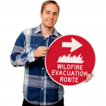
Safety & Security
Security and safety have never been more important. Visitors must not only be safe, but feel safe. Signs provide this assurance. From alligator attacks to cyberbullying, find fascinating posts on this topic.
-
Getting Attention – with Funny Signs
Explore humor in signs and see if any of these stories bring a smile – or just a sigh. Find a range of hilarious signs, including sidewalk signs, misguided signs and our famous “Funny Sign Friday” posts.
-
Custom Signs
Custom signs get attention and some of the best custom signs become famous historical landmarks. Explore some of the world’s most memorable and culturally significant signs. Find out what makes certain custom signs so special.