Appealing graphics and icons simplify tough tasks
We’ve all heard that picture is worth a thousand words. As it turns out, an image may also be worth a few milliseconds of valuable time. A study published in The Psychonomic Bulletin & Review found that eye-catching, appealing graphics on a mobile app or website promoted users’ ability to perform difficult tasks more quickly and easily.
“Savings of even a few milliseconds at a time all add up when one is performing multi-step interactions on a website or a mobile phone,” says researcher Irene Reppa, who contributed to the study.
When users like icons and graphics, they accomplish tasks more quickly.
It’s common for website and app developers to focus on usability and interactive ease, but this study suggests that the visual elements of a site or app shouldn’t be overlooked.
In the study, research participants were asked to memorize a specific icon. Then participants were asked to locate and identify that icon among nine options. When the task was simple, the aesthetic appeal of the icons didn’t seem to influence performance. However, as researchers made the task increasingly difficult, users were able to identify “appealing” icons with more speed and accuracy than icons rated less appealing. Researchers conclude that, “appeal can influence performance, especially under duress.”
The researchers present two previously established hypotheses that might explain why visual appeal matters when it comes to performance. The first hypothesis suggests that, when people experience joy (which they might do by viewing something pleasant), they are more likely to also experience prolonged motivation. In other words, they like something so they stick to it.
The other hypothesis is that pleasant visuals facilitate positive affect. People experiencing high positive affectivity are typically more alert, engaged, and confident.
How do you know if you’ve created a visually appealing graphic, image, or icon? The researchers focused on icons and found three factors that contributed to positive ratings of visual appeal. Those factors are, in order of importance:
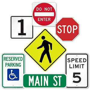
- Familiarity. An icon that is more recognizable or familiar tends to be rated more visually appealing. Our brains have to do less work to understand what the Apple logo or a stop sign represents, so we are drawn to these familiar icons.
- Visual complexity. Think you need to stuff your imagery full of detail to tell your story? Think again. Simpler icons are rated as more visually appealing than more complex icons.
- Icon concreteness. Concreteness refers to “the extent to which icons depict real objects.” Essentially, that means that the swoopy swirl you envision may be less compelling than, say, an image of a dog. However, the researchers are careful to note that familiarity trumps concreteness. That means that users don’t seem to mind non-concrete icons as long as those icons are familiar to them.
Interestingly, those same three factors are also “known to influence performance in tasks using icons.” We can navigate icon-based tasks faster and easier if the icons are: 1) familiar, 2) simple, and/or 3) concrete.
It’s important to note that the researchers make a clear distinction between “aesthetic appeal” and “aesthetic preference.” In their words, aesthetic appeal “refers to the power to attract or arouse interest, while preference refers to selecting one thing over another.” They define aesthetic appeal as “mild aesthetic experiences as evidenced via simple judgments by participants made on the basis of liking.”
That’s a fancy way of saying that the researchers are concerned with icons that command and sustain attention. In the real world, that’s what matters. It’s what matters for everything from billboards to websites, and from traffic signs to app design.
And, apparently, it’s the difference between struggling through a tough task and getting the job done a little easier and a little faster.


