


Massachusetts Reinvisions the Handicap Symbol With Student-Designed Pictorial
August 20, 2012 — Massachusetts gets a new handicap symbol this week, and it’s aimed at reorienting perspectives on the handicapped. Harvard design student Sara
 Hendren teamed up with philosophy professor Brian Glenney to create the new handicapped parking symbol, which is bright orange and depicts a disabled person bending forward on a moving wheel. “He doesn’t sit on a chair,” said Glenney. “He rides on it like a skateboard.”
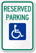
In contrast, the preexisting international accessibility symbol is plain white and shows a straight-backed, disabled person. According to Glenney, the intention was to cast disabled persons in a dynamic and active light, as opposed to a passive light. In doing so, the symbol is meant to portray disabled persons as real individuals, not lifeless stick figures.

The original international accessibility symbol (via MyParkingSign).
The duo graffitied the symbol’s maiden voyage in a parking lot of Triangle, Inc in Malden, MA. The choice isn’t random: Triangle is a regional not-for-profit dedicated to empowering disabled persons to lead fulfilling lives. “It’s not people with disabilities,” Malden Mayor Gary Christenson said. “It’s people with abilities.”

The old wheelchair symbol, some argue, miscasts the disabled as passive, static, and non-dynamic, when the reality is that disabled men and women are active and forward-thinking members of our society.
The new symbol may threaten the longstanding reign of the current symbol, designed by Susanne Koefoed in 1968. The symbol was created to denote handicap accessible facilities and products. The symbol can be seen nearly everywhere, most notably on handicap parking signs required by the Americans with Disabilities Act. With enough attraction, though, it’s a possibility that this forward-thinking new symbol will have the potential to spread nationally or even internationally.
– N. Gilliat
Like this topic? Check out our related products:
-


ADA iParking Signs
-
ADA Parking Signs
-

Disabled Parking Signs